Data visualization transforms raw data into graphical formats, enabling quick interpretation through charts, graphs, and maps. Data storytelling combines these visuals with narrative elements to contextualize insights, making complex information more relatable and memorable. Effective communication relies on merging both techniques to engage audiences and drive informed decision-making.
Table of Comparison
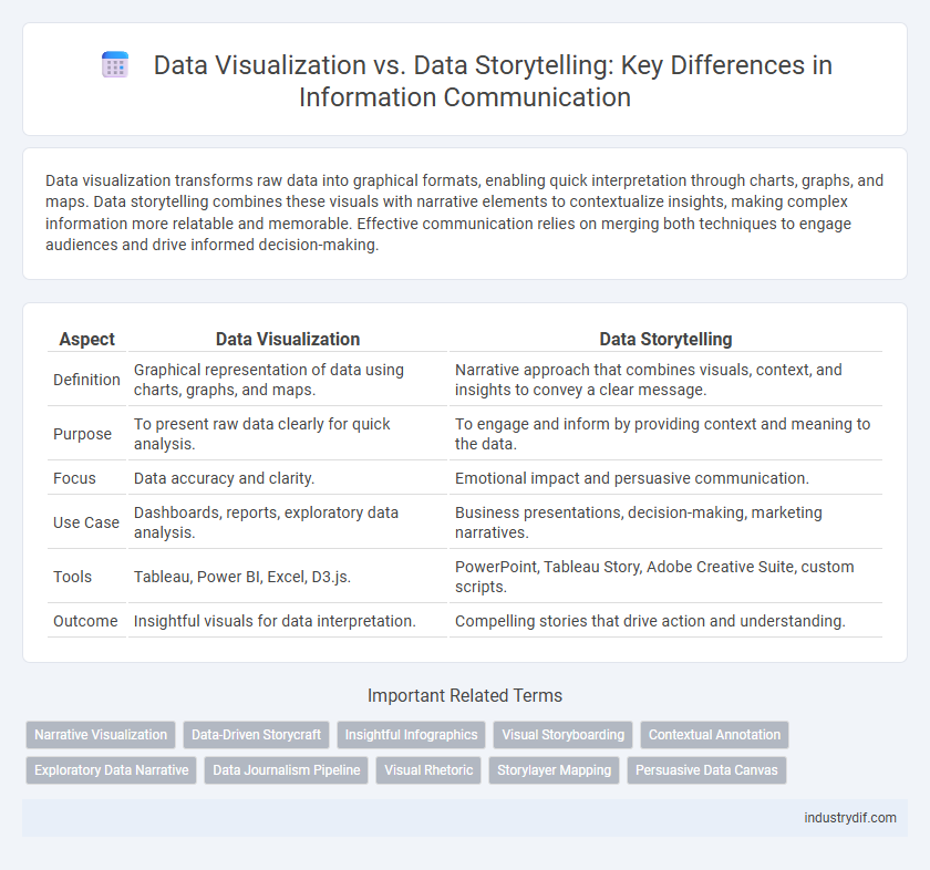
| Aspect | Data Visualization | Data Storytelling |
|---|---|---|
| Definition | Graphical representation of data using charts, graphs, and maps. | Narrative approach that combines visuals, context, and insights to convey a clear message. |
| Purpose | To present raw data clearly for quick analysis. | To engage and inform by providing context and meaning to the data. |
| Focus | Data accuracy and clarity. | Emotional impact and persuasive communication. |
| Use Case | Dashboards, reports, exploratory data analysis. | Business presentations, decision-making, marketing narratives. |
| Tools | Tableau, Power BI, Excel, D3.js. | PowerPoint, Tableau Story, Adobe Creative Suite, custom scripts. |
| Outcome | Insightful visuals for data interpretation. | Compelling stories that drive action and understanding. |
Understanding Data Visualization
Data visualization transforms complex data sets into visual formats like charts, graphs, and maps, enabling quicker pattern recognition and insight generation. Effective data visualization relies on principles of design, clarity, and accuracy to ensure users interpret information correctly. Tools such as Tableau, Power BI, and D3.js enhance the ability to represent quantitative data visually, improving decision-making processes.
Defining Data Storytelling
Data storytelling combines data visualization with narrative techniques to communicate insights clearly and compellingly. It transforms complex data into engaging stories that highlight patterns, trends, and actionable conclusions. This approach enhances understanding by connecting raw data to real-world contexts through a structured, meaningful narrative.
Key Differences Between Data Visualization and Data Storytelling
Data visualization emphasizes the graphical representation of data through charts, graphs, and maps to facilitate quick insight and pattern recognition. Data storytelling combines these visual elements with narrative techniques to create a compelling context that drives decision-making and emotional connection. The key difference lies in data visualization's focus on clarity and accuracy of data display, whereas data storytelling integrates context and interpretation to engage audiences and convey a deeper message.
Core Components of Effective Data Visualization
Effective data visualization relies on clear, accurate representation of data through intuitive charts, graphs, and maps that highlight key trends and patterns. Core components include appropriate use of color, scale, and labels to enhance readability and avoid misleading interpretations. Emphasizing simplicity and context ensures audiences grasp insights quickly and make informed decisions based on the visual data.
Elements of Compelling Data Storytelling
Compelling data storytelling integrates visual elements such as charts, graphs, and infographics with a coherent narrative that guides the audience through insights and patterns. Essential elements include a clear storyline reflecting the data's purpose, contextual background to enhance understanding, and emotional engagement to connect with the audience. Effective use of color, typography, and design principles further amplifies message clarity and retention in data storytelling.
When to Use Data Visualization vs Data Storytelling
Data visualization is ideal for presenting complex datasets through charts, graphs, and maps to reveal trends, patterns, and outliers quickly. Data storytelling should be used when you need to communicate insights, create emotional connections, and drive decision-making by integrating narrative with visuals. Choosing between data visualization and data storytelling depends on whether the goal is immediate data comprehension or influencing an audience with a structured story around the data.
Industry Applications: Visualization and Storytelling in Practice
Data visualization enhances industry decision-making by transforming complex datasets into clear, interactive graphics that reveal trends and outliers, facilitating faster analysis in sectors like finance, healthcare, and marketing. Data storytelling integrates these visuals with narrative techniques to provide context, emotional engagement, and actionable insights, improving stakeholder communication and driving strategic initiatives. Industries such as retail use storytelling to connect consumer data with purchasing behavior, while manufacturing applies visualization to monitor production efficiency and predict maintenance needs.
Tools and Technologies for Data Visualization and Storytelling
Data visualization tools like Tableau, Power BI, and D3.js enable the creation of interactive charts and dashboards by transforming raw data into visual formats. In contrast, data storytelling platforms such as Flourish and StoryMapJS integrate narrative elements with visuals to convey insights effectively. Emerging technologies, including augmented reality (AR) and artificial intelligence (AI), are enhancing both visualization and storytelling by enabling dynamic, context-rich presentations.
Common Challenges in Visualizing and Narrating Data
Common challenges in visualizing and narrating data include ensuring clarity while avoiding oversimplification or misinterpretation of complex datasets. Effectively balancing aesthetic design with accurate data representation often impacts audience engagement and comprehension. Addressing cognitive biases and varying data literacy levels remains critical for delivering impactful data visualizations and narratives.
Future Trends in Data Visualization and Storytelling
Emerging technologies such as augmented reality (AR) and virtual reality (VR) are set to transform data visualization by creating immersive and interactive experiences that enhance data comprehension. Advances in artificial intelligence (AI) enable automated narrative generation, bridging the gap between raw data and compelling storytelling tailored to specific audiences. Future trends emphasize integrating real-time data streams with dynamic visual narratives, fostering deeper insights and more impactful decision-making across industries.
Related Important Terms
Narrative Visualization
Narrative visualization integrates data visualization with storytelling techniques to create compelling and insightful narratives that enhance user understanding and engagement. Unlike traditional data visualization, which primarily presents raw data, narrative visualization guides the audience through a structured storyline, making complex information more accessible and memorable.
Data-Driven Storycraft
Data-driven storycraft integrates data visualization techniques with narrative elements to transform complex datasets into compelling, actionable insights that enhance decision-making and audience engagement. Unlike traditional data visualization that emphasizes graphical representation alone, data-driven storytelling contextualizes data within a meaningful story framework, fostering deeper understanding and emotional connection.
Insightful Infographics
Insightful infographics enhance data visualization by combining clear graphical representations with compelling narratives that highlight key insights and trends. Data storytelling transforms complex datasets into engaging, easy-to-understand stories, making information more memorable and actionable for diverse audiences.
Visual Storyboarding
Visual storyboarding in data storytelling transforms raw data into a compelling narrative by combining charts, graphs, and images to guide viewers through insights with clarity and emotional impact. Unlike traditional data visualization, which prioritizes isolated data points, visual storyboarding strategically sequences visuals to create a cohesive story that enhances understanding and decision-making.
Contextual Annotation
Data visualization presents raw data through graphical elements such as charts and graphs, while data storytelling incorporates contextual annotation to highlight insights, trends, and significance within the data. Contextual annotations enhance comprehension by connecting visual elements to their underlying narrative, making complex information more accessible and actionable.
Exploratory Data Narrative
Exploratory data narrative in data storytelling emphasizes uncovering insights through interactive visualizations that invite users to analyze patterns and trends independently. Data visualization serves as the foundational tool, but storytelling transforms raw data into meaningful contexts that guide deeper understanding and decision-making.
Data Journalism Pipeline
Data visualization transforms complex datasets into interactive charts, graphs, and maps, enabling journalists to communicate quantitative insights clearly within the data journalism pipeline. Data storytelling integrates these visuals with narrative elements and contextual analysis, providing audiences with a comprehensive understanding of the news by linking data-driven evidence to real-world implications.
Visual Rhetoric
Data visualization employs visual rhetoric to present complex datasets through charts, graphs, and maps, enhancing comprehension by emphasizing patterns and relationships. Data storytelling integrates these visual elements with narrative techniques to create compelling, context-rich presentations that drive emotional engagement and informed decision-making.
Storylayer Mapping
Storylayer mapping enhances data storytelling by organizing complex datasets into coherent, layered narratives that guide audience interpretation and insight discovery. Unlike traditional data visualization, which primarily presents raw data visually, storylayer mapping integrates contextual storytelling elements to deepen engagement and clarify key messages.
Persuasive Data Canvas
The Persuasive Data Canvas enhances data storytelling by structuring visualizations to emphasize key insights and emotional resonance, transforming raw data into compelling narratives that drive decision-making. Unlike traditional data visualization, which focuses on graphical representation, the Persuasive Data Canvas strategically integrates context, audience needs, and narrative flow to maximize the impact of data communication.
Data Visualization vs Data Storytelling Infographic